How to make a scientific poster
Posters are one of the two main forms of communicating scientific research at conferences. Research posters summarise information or research concisely and attractively to help generate discussion. At a conference, a researcher stands by the poster display while other participants can come and view the presentation and interact with them.
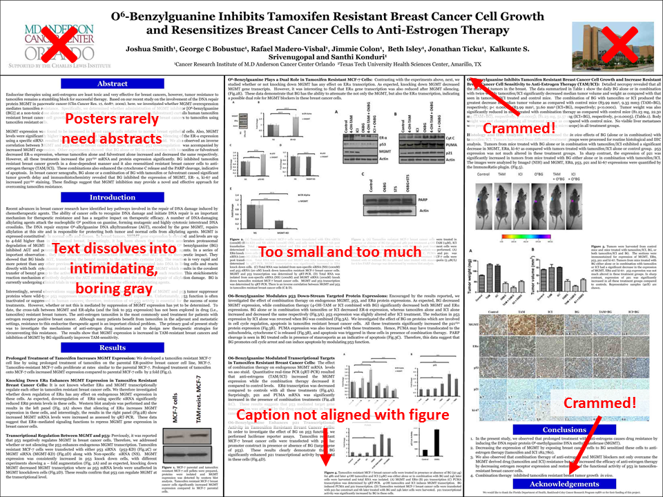
 Unfortunately, most posters that are presented at conferences by professional scientists tend to be terrible. Why? Well often they're treated as a bottomless pit to dump all of your data, graphs and technical lingo. They usually have way too much text that's too difficult (and boring) to read, making the poster unappealing to anyone browsing from afar.
Narrative
Before you even start to try and design your poster, you need to figure out what the overall point of it is and how you should go about communicating that.
- What is the most important/interesting/astounding finding from my research project?
- Who is my target audience and what level of understanding will they have beforehand?
- What information is absolutely vital to get my point across and what can be excluded as details I can say in person if anyone asks?
- Are there any props, demos, videos etc. in addition to my poster that I can bring along to add to my poster presentation?
Once you've worked out these aspects, you should think about the narrative structure of your poster. Any form of communication, be it a story, news item or a conference presentation, should follow some basic narrative structure that takes your audience on a journey from beginning to end. Often in science we tend to follow a fairly standard structure: title, introduction, methods, results, analysis/discussion, conclusions. However, these are in a way just a reframing of a standard storytelling structure: hook, setup, tension, climax, resolution. You should think about the structure in both of these contexts and work out which areas are appropriate and what needs to go in them to communicate your points coherently.
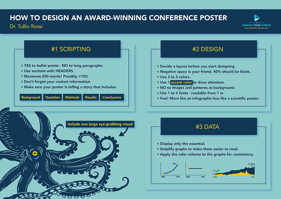
Use as few words as possible
The primary purpose of a poster is not to communicate every little detail of your research, but to attract people’s attention and serve as a conversation starter. A poster should use visuals to draw people in from a distance. Then, as people step closer and begin reading it, the words along with the visuals will start to communicate the background to your work, why you've done it, and what it means.
Think of the poster overall as being a visual summary of the entire work. It is not a scientific paper. Bullet points are your friend and full paragraphs should be avoided wherever possible.
What visuals do I need?
Think about how you can visually share your research. What will compel people to walk towards your poster? Not every single graph, chart or photo you might have produced can fit on your poster. You need to carefully select only the essentials to get your point across. Make sure that any graphs you make are clearly understable, they shouldn't need tonnes of explanation to get their point across.
Start designing
 Only now are you ready to contemplate opening up some software and starting to design your poster. Common software packages used are Powerpoint, Inkscape or Adobe Illustrator and you can find various templates either within them or online. Your final poster should be sent as a single PDF document set to the correct size (A1 for Cosmic Con posters) and orientation (either portrait or landscape). You should play with the layout and find a way that will easily guide readers to follow your narrative and will work with the visuals you have. Panels can help with this, but make sure their order is obvious. Also, don't forget to include your poster's title, your names and where you're from at the top. Any references you need to include can be in their own small section at the end and can use shorter forms of referencing, this isn't a full blown paper after all.
Don't try and cram too much into your poster. Negative space is almost as important as all the visuals and text. Make sure you leave enough space at the edges of your poster and between all the panels and visuals. Avoid background pictures or photos as they can be distracting.
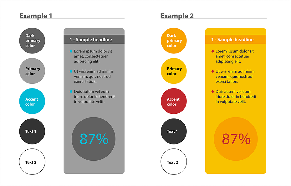
 Be careful with your use of colour. Colour is attractive, but when pairing too many colours together your poster can easily start to look hideous. Have two or three shades of a primary colour of your choice, an accent colour that stands out, and a couple of text colours. In a colour scheme of this kind, you can use the accent colour to draw attention to where you want people to look. The important thing is that you use the accent colour in moderation.
Finally, make sure you use a clear simple font and that you set the sizes large enough. People need to be able to read everything stood at a fair distance from your poster.
Don't forget the presentation
Posters are conversation starters, so presenting a poster is absolutely vital. You should prepare a 30 second to 1 minute elevator pitch of your work which will take people quickly through your poster and its main points. This is also where you can show off any of your additional materials.
Be open to questions and answer them as honestly as possible. If you don't know the answer or you've not tried or thought about what the person says, politely say so. This is much better than trying to make up an ill-informed explanation on the fly.
Further information
See the below guides for further tips on making a scientific poster: